










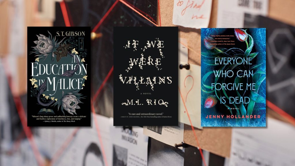


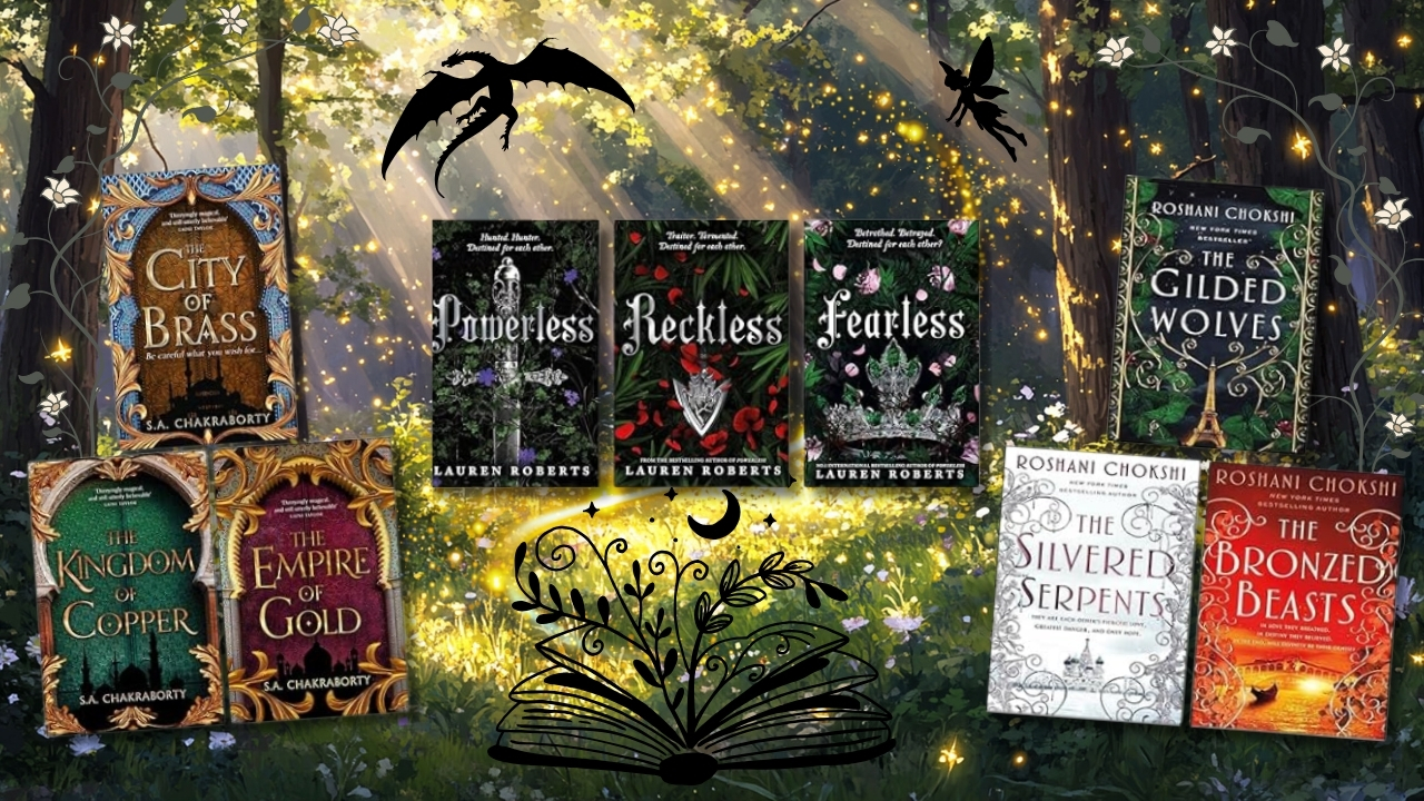
Some book series feel like they were made to live next to each other, not just because the stories connect, but because the covers do. Matching tones, complementary colors, and a shared mood can turn a random shelf into a curated masterpiece. These ten fantasy and fantasy-adjacent series weren’t designed as a set, but when lined up side-by-side, they somehow belong. Think of it as a literary color palette, dark jewel tones, metallic accents, floral or symbolic designs, and just enough drama.
But don’t worry, it’s not just about the covers. These books hold worlds of rebellion, magic, romance, and unraveling identities. They’re the kind of series that look cohesive and read like your next ten obsessions.
The Books of Ambha Duology by Tasha Suri
The covers match the story’s tone perfectly: deep, warm desert colors like shadowy blue and muted ruby, all enclosed in symmetrical borders and fine, ornamental linework. They have a sacred, almost ancient look that feels both grounded and elegant. When lined up with deeper jewel tones or black-and-gold designs, these books provide a serene yet commanding visual contrast.

This duology — Empire of Sand and Realm of Ash — is a gorgeously told South Asian-inspired fantasy centered on devotion, choice, and survival in an oppressive empire. Tasha Suri’s writing is quiet but powerful, weaving in themes of faith, grief, and rebellion through deeply personal journeys.
Powerless Trilogy by Lauren Roberts
Visually, the series leans hard into the sleek-modern side of fantasy: matte black covers, bold serif fonts, and touches of metallic gold, silver, or red that glint under the light. It’s the aesthetic equivalent of a black leather jacket; clean, edgy, and effortlessly cool. These books pair beautifully with any series that uses a minimalist layout with bold details, especially when placed next to deep red or gold-accented neighbors.

If enemies-to-lovers angst, deadly trials, and characters with morally gray motivations are your thing, Powerless (and its sequels) delivers. The series follows Paedyn, a girl with no powers pretending to have them in a kingdom where that lie could get her killed, and it only gets messier from there.
Sins of the Zodiac Series by Caroline Peckham & Susanne Valenti
The aesthetic is gothic glam. The covers are intense but elegant; deep blacks, metallic foils, and ornate symbolic designs. Each book plays with the same core layout and color scheme, making the whole series feel like a collector’s dream when displayed together. They fit beautifully alongside Powerless or Crimson Moth, creating a shelf full of dark fantasy drama.

If you like your fantasy dark, unhinged, and soaked in emotional trauma (plus a dash of enemies-to-lovers and a few broken hearts), then the Sins of Zodiac series is probably already on your radar. This series, from the authors of Zodiac Academy, is packed with angst, tension, and characters who will destroy you.
The Atlas Series by Olivie Blake
These covers reflect this intellectual chaos in the most organized way possible: matte finishes, circular geometry, alchemical symbols, and clean white fonts. They look like blueprints for magical knowledge; dark, mysterious, and precise. These books are the glue that aesthetically unifies a shelf full of different series.

Dark academia, secret societies, and beautifully broken characters? The Atlas series has it all. It follows six gifted magicians recruited into a mysterious society that guards the world’s arcane knowledge, but only five can make it through the trials. It’s moody, philosophical, and full of chaotic genius energy.
The Inheritance Games Series by Jennifer Lynn Barnes
Even though it’s a mystery/thriller and not technically fantasy, the design of this trilogy holds its own. Deep greens and teals, gold embellishments, and embossed lettering make the books feel like puzzle boxes. They’re rich and playful, bringing a little energy to a darker shelf. Visually, they complement fantasy titles with gold or ornate typography, especially ones like Atlas Six or Gilded Wolves.

In The Inheritance Games, a girl inherits billions from a man she’s never met, gets thrown into a house full of puzzles and secret passageways, and has to survive the schemes of his extremely charming grandsons. It is sharp, twisty, and mysterious in all the best ways.
The Scholomance Trilogy by Naomi Novik
Design-wise, these books are stripped down: no character art, no clutter, just solid colors, central icons, and balanced fonts. The off-white and black color scheme with gold detailing makes them pop on a shelf while still matching minimalist fantasy styles. They act as a breather among darker or more ornate books, creating balance and contrast without losing the theme.

Monsters, magic school, and a heroine with a sharp tongue and a moral compass made of barbed wire, The Scholomance Trilogy is unlike any other magical school series. El’s journey from angry loner to accidental savior is laced with sarcasm and sincerity.
The Gilded Wolves Trilogy by Roshani Chokshi
These covers are pure beauty: floral and weaving details in gold, layered over deep, moody colors like emerald and vermillion. They radiate richness and melancholy. Visually, they tie in seamlessly with Daevabad or Crimson Moth, elevating the shelf into something rich and layered.

Set in an alternate 19th-century Paris, this trilogy follows a group of gifted outcasts who pull off magical heists while dealing with betrayal, found family feels, and the ghosts of colonialism. The Gilded Wolves is lush, emotional, and devastatingly beautiful, both in the story and the design.
The Crimson Moth Series by Kristen Ciccarelli
These covers are built to stand out: deep reds, sharp blacks, bold typography, and striking central symbols. The designs have some drama to them, but it’s toned down with clean lines and a good sense of balance. These books hold their own visually while also matching the tone of series like Powerless or These Violent Delights.

In a world ruled by vampires, one girl becomes a masked rebel fighting back. The Crimson Moth series is fierce, romantic, and unapologetically dramatic, with vibes in between a revolutionary fairytale and a rebellion.
These Violent Delights Duology by Chloe Gong
The covers are modern gothic: red, black, and gold used with careful precision; central objects like daggers and roses; and a layout that balances chaos with clarity. When paired with Gilded Wolves or Crimson Moth, the visual storytelling becomes seamless.

Set in Shanghai in the 1920s, with rival gangs and a mysterious plague. As well as two ex-lovers who’d rather stab each other than admit they still care. These Violent Delights is a sharp retelling of Romeo and Juliet, soaked in blood, longing, and political chaos.
The Daevabad Trilogy by S.A. Chakraborty
Visually, this series takes center stage on any shelf. The covers feature stunning silhouettes of magical cities, glowing with vibrant colors like sapphire blue, gold, and emerald. The designs are symmetrical and powerful. When placed beside The Books of Ambha or Gilded Wolves, they create a unified royal, magical vibe that feels intentional.

A con woman from Cairo accidentally summons a warrior djinn and is dragged into a centuries-old magical kingdom filled with court politics, rebellion, and ancient grudges. The Daevabad Trilogy is epic in every sense, complex, cinematic, and deeply character-driven.
Your Bookshelf, But Make It Cohesive
These series span narratives, authors, and publishers, but together, they look like they were made to share a shelf. Some are all about bold colors, while others lean into symmetry, symbols, or that nice textured finish. But when combined, they create a kind of visual harmony, one that reflects the stories inside: bold, magical, emotional, and a little dangerous.
You don’t need matching box sets to have a shelf that looks like a curated collection. Sometimes, it’s just about finding books that speak the same visual language. These books weren’t made to go together, but somehow, they do.
Check out our Fantasy Duology Recommendations — all the magic, drama, and aesthetic vibes in two-book packages.
Want even more fantasy? Browse the Bookstr-curated Fantasy Bookshelf on Bookshop